portfolio
Step one: find a data visualization (with data you can use!)
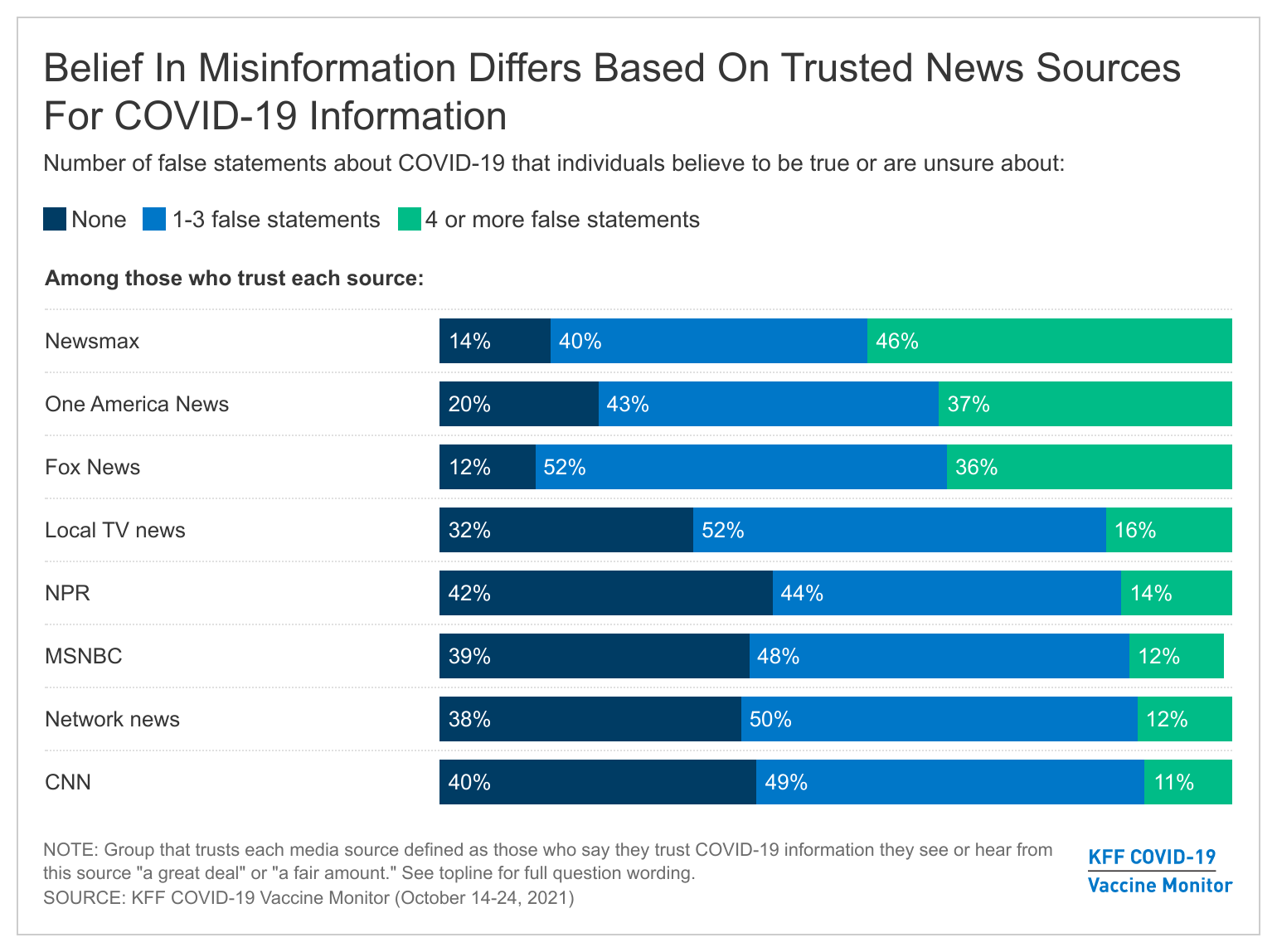 Source : https://www.kff.org/coronavirus-covid-19/poll-finding/kff-covid-19-vaccine-monitor-media-and-misinformation/
Step two: critique the data visualization
- Usefulness : (8/10) It shows which news sources provide more biased or false information to audiences.
- Completeness : (6/10) It has minor errors (ex: MSNBC’s total percentage is not 100%) and it misled audiences think 1 to 3 false of statements is positive.
- Perceptibility : (6/10) We cannot interpret charts without looking it closer and its sorting order is quite difficult to recognize.
- Truthfulness : (8/10) It is based on a survey and back datas.
- Intuitiveness : (5/10) It is difficult to understand what charts want to show before we fully read the text of charts.
- Aesthetics : (7/10) This chart looks good to provide the information to audience.
- Engagement : (8/10) It is fully engaged to what the author wants to say.
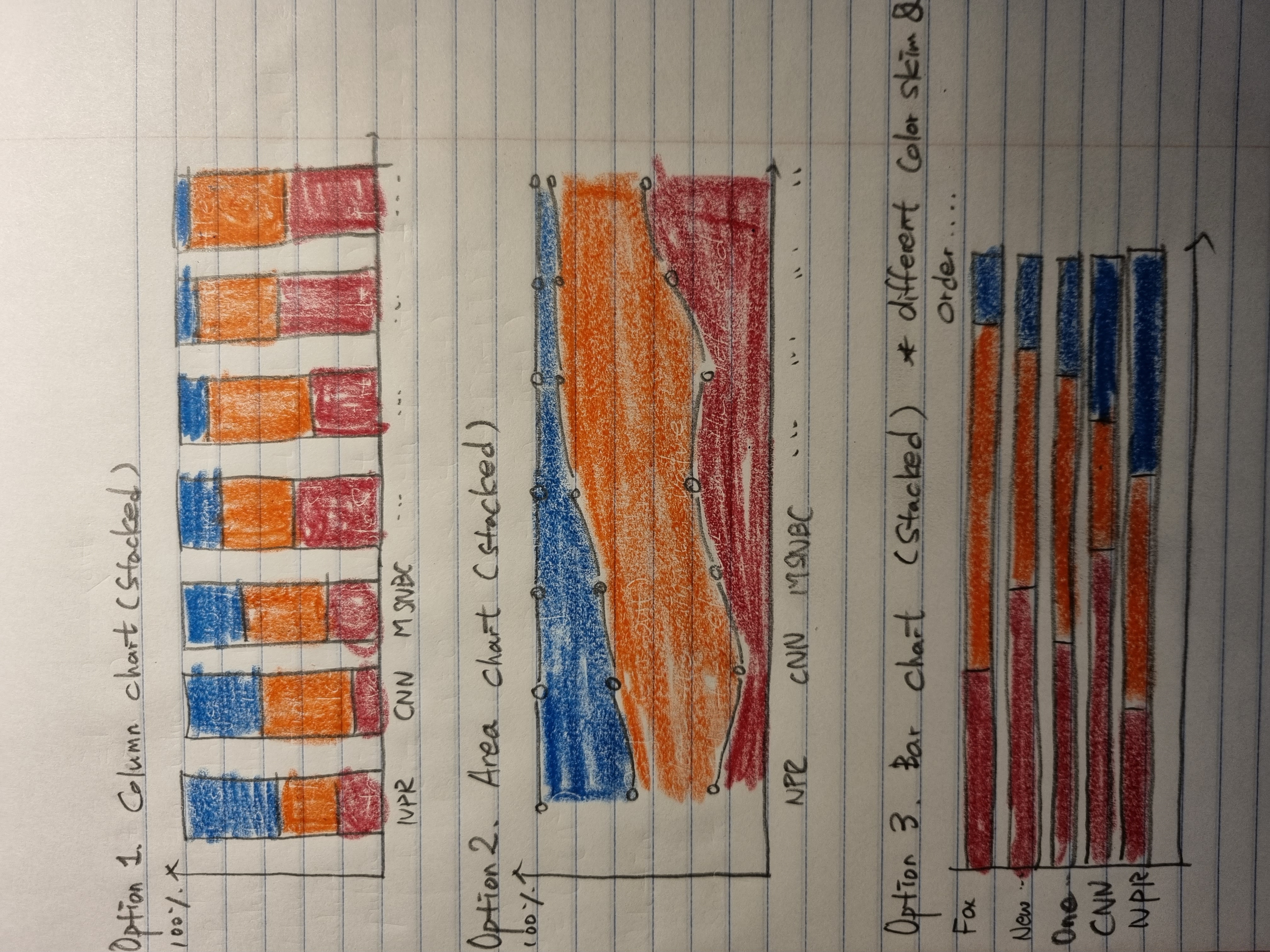
Step three: sketch out a solution
Step four: Test the solution
First Feedback (in late 20s):
1. Preference : Option 1, 3
2. Color (Blue, Red) is too strong to distinguish which information is more important.
3. Following the keyword Misinformation, None part should get less attention.
4. Option 1, 2 seems that it is information about progress or increase and decrease something over time.
5. Names of sources will not show well in Option 1, 2.
6. It is difficult to know what the order on the chart was based on.
Second Feedback (in late 30s):
1. Preference : Option 1
2. I prefer to see the option 1 chart because I get familiar with this type of charts rather than other style.
3. It seemed so packed if you want to draw charts with the same number of sources.
   (column bar will be so narrow and the name of source cannot show well.)
4. This chart looks that it has an order by None (blue) part.
5. Option 2, each line seems to be connected and have corelation with one another. <Not a good choice>
6. Legends are so difficult to understand so more explanation should be added.
With feedbacks, I revised the chart
Third Feedback (during the class)
1. It is still difficult to find which new source is biased most.
2. Stack barcharts and the other candidates are what we are so familiar with, so it is likely to be threadbare.
3. Try to find the chart you do not use often and translate the chart with your own words.
Step five: Build your solution
My suggestion
Change colors and adopt new format to grab the audience’s attention.
Help audiences to recognize which News Sources are more biased or deliver the misinformation more.
Analysis Report
Audience can believe misinformation from news sources because they think news sources are neutral and based on facts. However, news conveys information from different perspectives, and sometimes misleading or distorted information. There is a political preference for each news sources. Moreover, in some cases, the purpose of the news is not to deliver accurate information, and it induces continuous subscription by producing information from the perspective that the main subscriber wants. From this chart, three news sources (Fox, Newsmax, One america news) seem to broadcast more false information rather then other news sources. They are very likely to mislead their audiences. In contrast, CNN and NPR deliver facts based information about Covid. It is very difficult to say they do not mislead readers at any points, but their audiences tend to be well informed about Covid-19. I changed scales from neutral to very likely (5 scales). Neutral and facted-based information is what audiences expects from news sources. I hesitated to put middle scale “fairly” but readers who trust CNN and NPR still have many false information. From this chart, I hope readers will have time to fact-check information from news sources they trust or compare how different each new sources handle the same event or content differently. In addition, those who have a negative view of the government’s response to Covid-19 due to Fox, or those who are skeptical about vaccines, etc., will once again compare the contents presented in various media.